graphics_test, a MATLAB code which illustrates how various kinds of data can be displayed and analyzed graphically.
MATLAB's built-in graphics functions are used to create these images.
Some common plot types include:
The information on this web page is distributed under the MIT license.
graphics_test is available in a C/dislin() version and a C/gnuplot() version and a C++/dislin() version and a C++/gnuplot() version and a Fortran90/dislin() version and a Fortran90/gnuplot() version and a MATLAB version and an Octave version and a Python version and an R version.
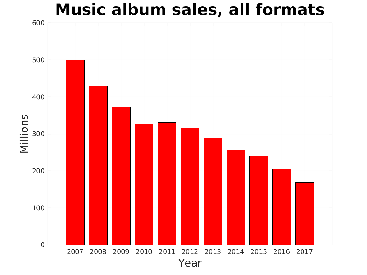
album_bar lists the year, and total number of music albums (LP's, cassettes, CD's and downloads) sold each year from 2007 to 2017. This data is plotted as a bar graph.
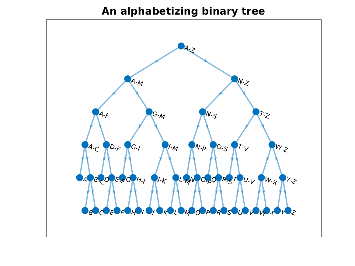
alphabet_binary_tree describes a binary tree that could be used to alphabetize letters.
automobile_scatter contains prices and weights of cars available in 1985. A scatter plot is to be made.
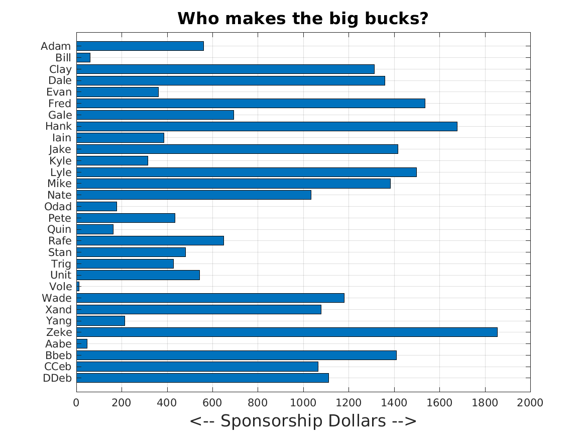
basketball_barh displays the sponsorship dollars for each of 30 basketball players, against their names. A horizontal bar graph is used, which makes it easier to display the name next to the bar. MATLAB's readtable() command is needed in order to handle the data file, which contains a mixture of text and numeric data.
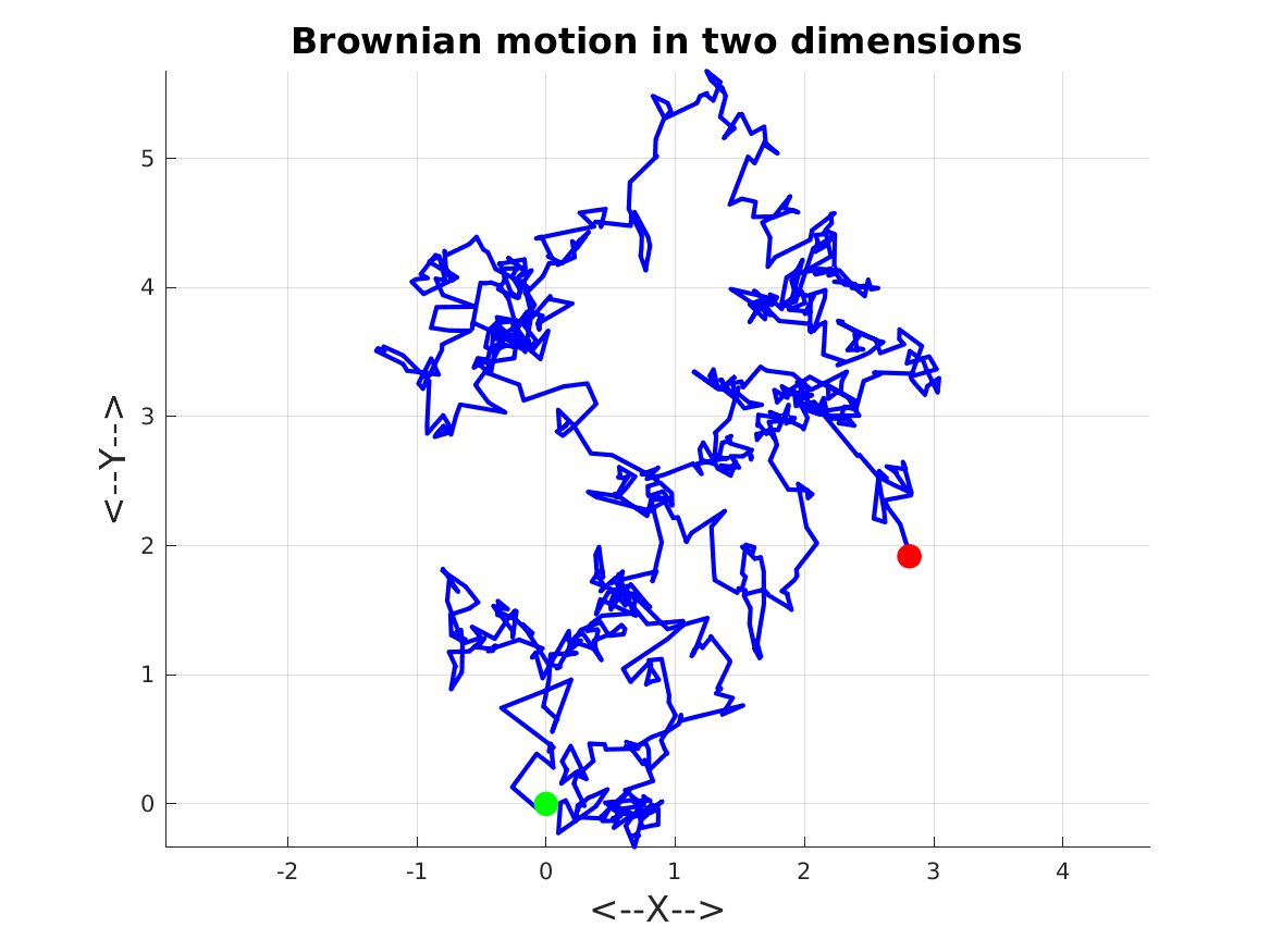
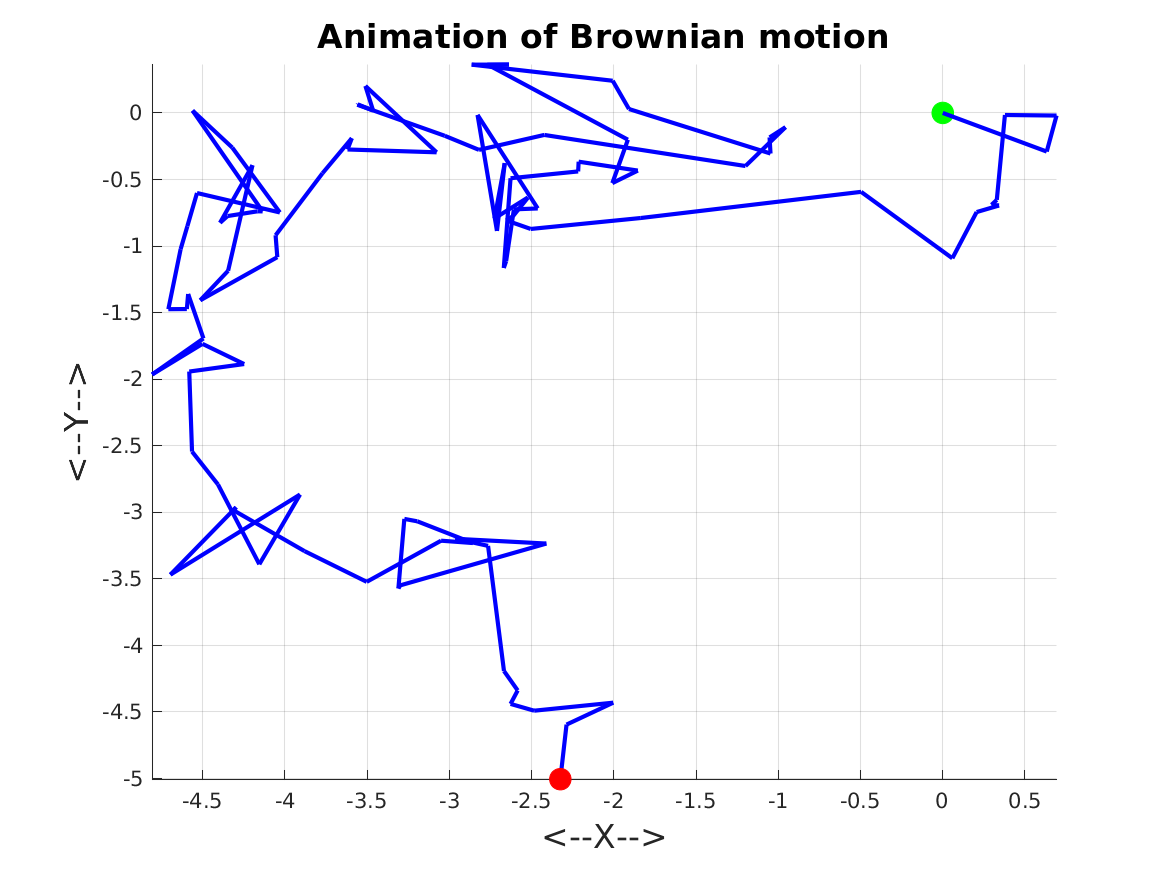
brownian_2d_plot plots data representing 1000 steps of Brownian motion in two dimensions. Unlike a typical y=f(x) plot, this data wanders around the page.
brownian_animation animates Brownian motion by drawing one more step every 1/4 second of viewing time.
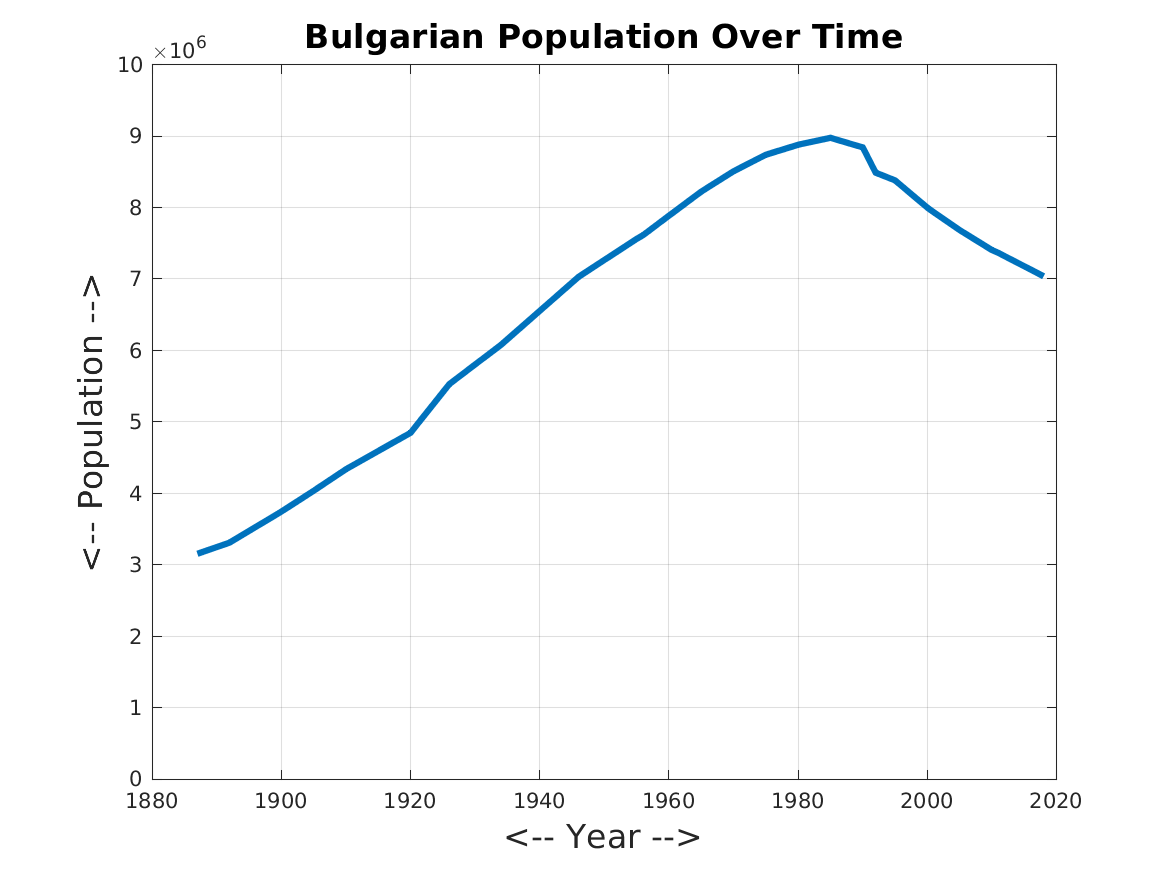
bulgaria_plot takes data about the Bulgarian population over time and makes a plot of (time,population).
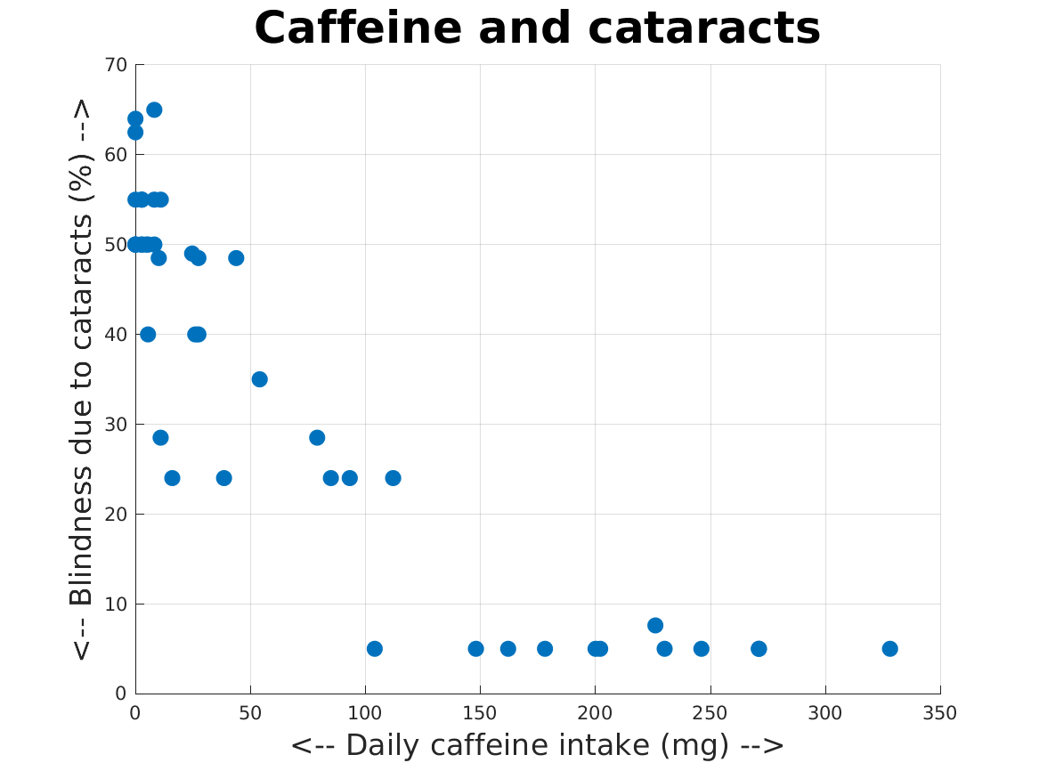
caffeine_scatter seeks a relationship between the percentage of blindness due to cataracts, and the daily intake of caffeine, in a number of countries. A scatter plot is produced.
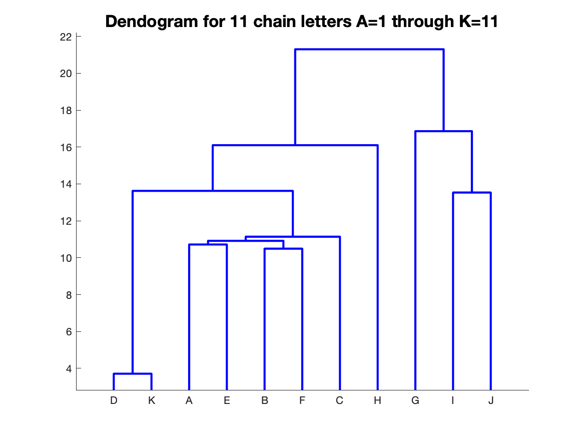
chain_letter_dendrogram considers the relatedness of 11 chain letters by using a distance matrix to construct a dendrogram.
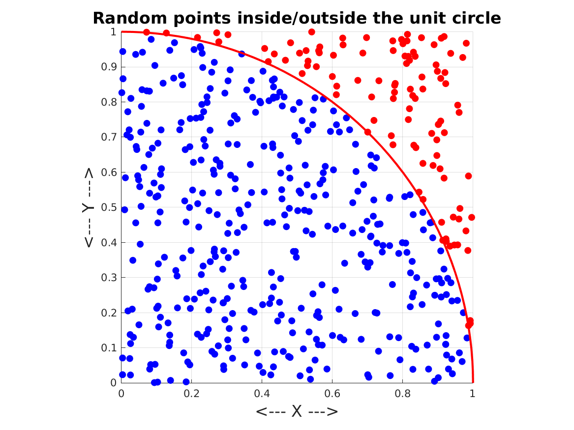
circle_scatters depicts 500 pairs of (X,Y) data points in the unit square, 395 of which lie inside the unit circle, and 105 outside. On a single graph, we display scatter plots of the inside points (blue), the outside points (red), and a line representing the perimeter of the circle.
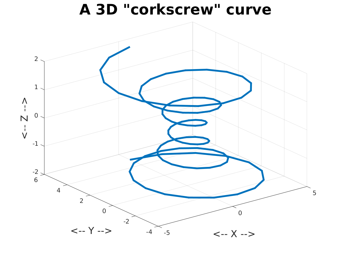
corkscrew_plot3d generates (X,Y,Z) points on a curve, and makes a 3D line plot.
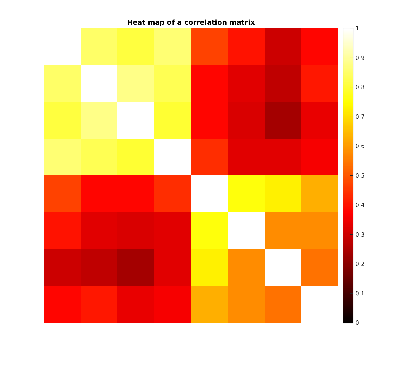
correlation_heat_map takes an 8x8 correlation matrix and draws an 8x8 grid of squares, colored white for the highest values, yellow, then red, and black for the lowest.
corvette_scatter considers the resale price for Corvettes by model year, displaying the results as a scatter plot.
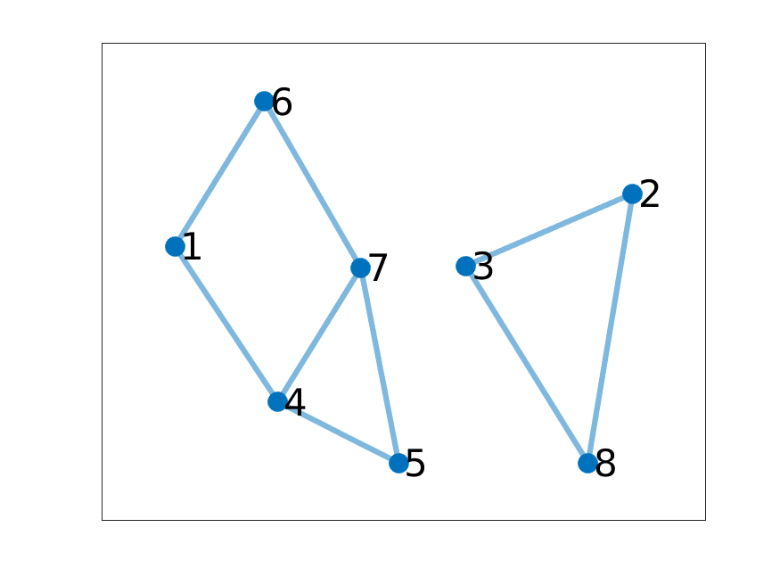
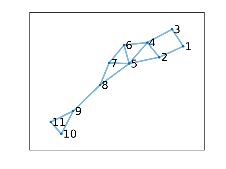
disconnected_graph plots a disconnected graph of eight nodes.
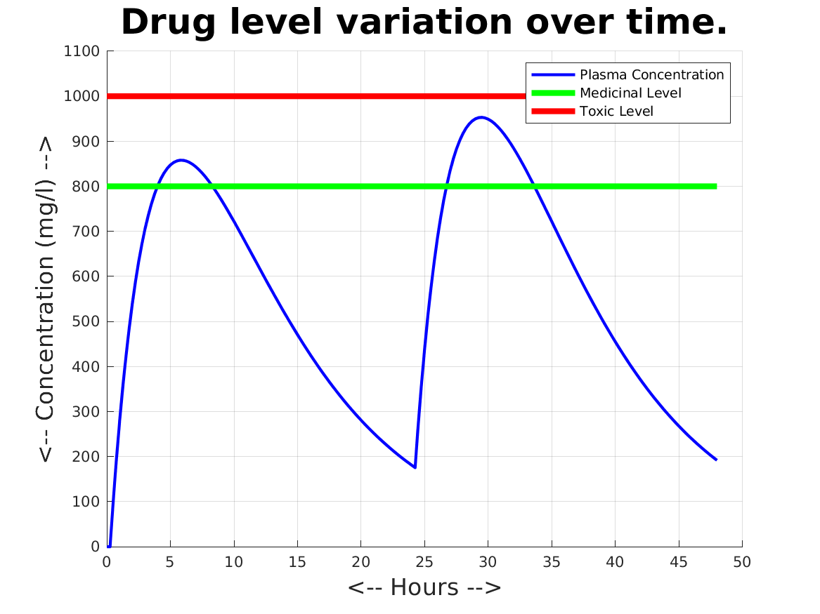
drug_dosage_plots depicts measurements over 48 hours of the blood level concentration of a medicinal drug. The drug needs to reach a certain level to have an effect, but must not exceed the toxic level. A graphic is created which shows, on one plot, the concentration over time, the minimal effective level, and the maximum nonlethal leval.
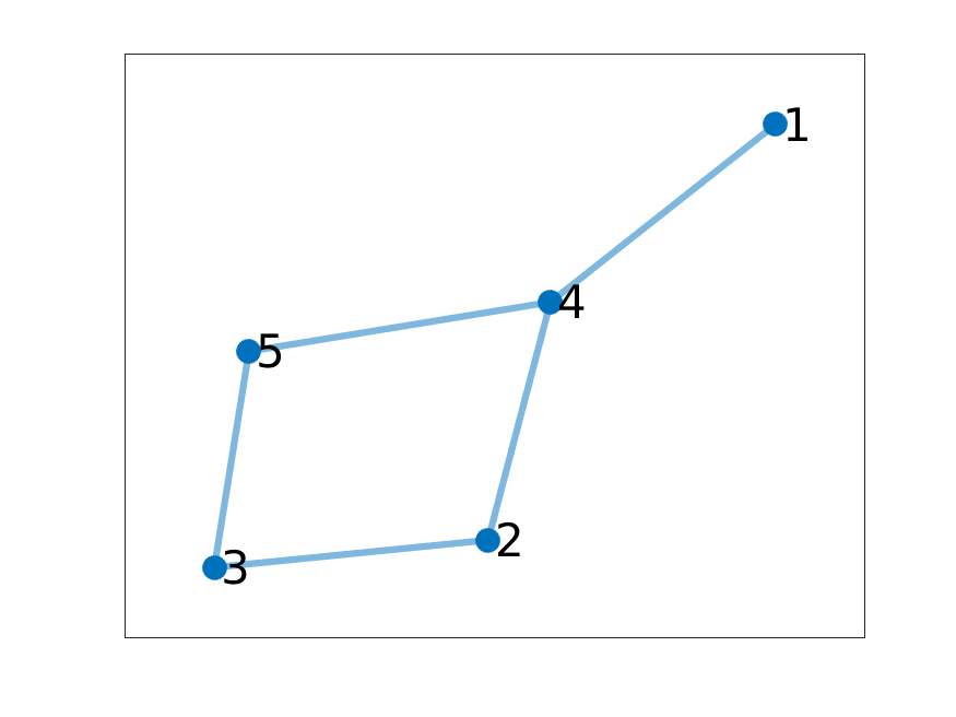
five_node_graph plots a graph of five nodes.
flow_vector plots a velocity vector field.
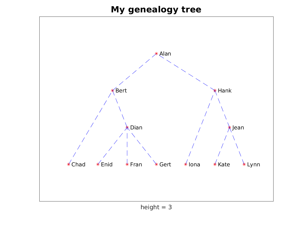
genealogy_tree uses MATLAB's treeplot() command to create a tree diagram of a genealogy.
geyser_bar works with measurements of the waiting time in minutes between successive eruptions of the Old Faithful geyser. The data has been grouped into bins. The bin counts are displayed as a bar chart.
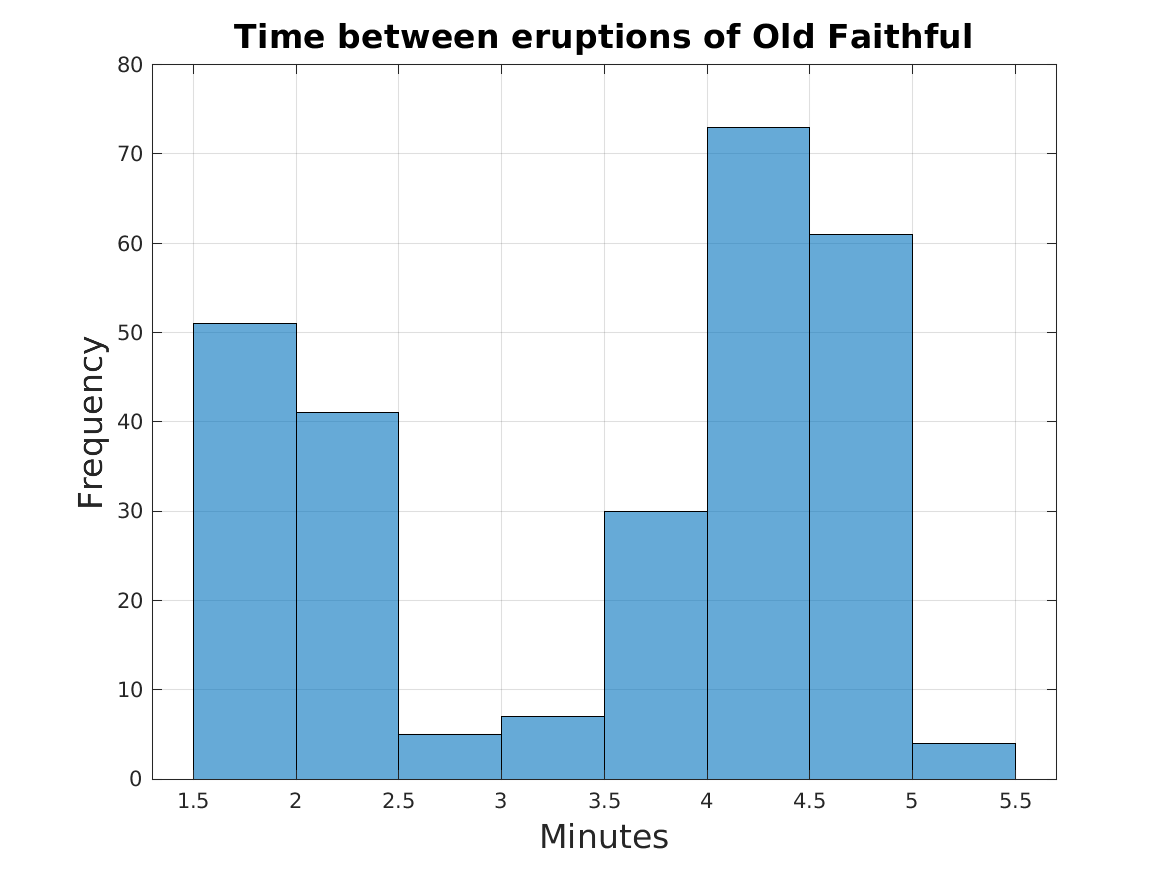
geyser_histogram contains the waiting time in minutes between successive eruptions of the Old Faithful geyser.
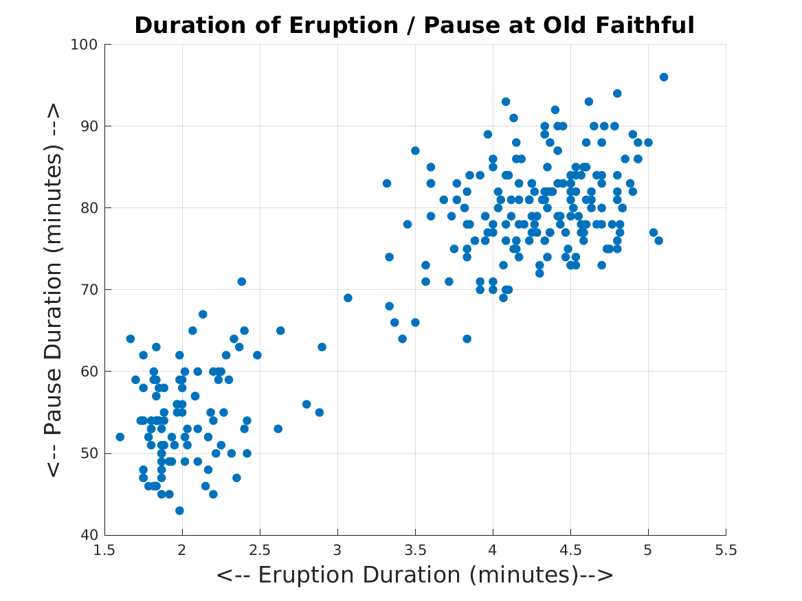
geyser_scatter looks for relations between the duration in minutes of the eruption and following waiting times for the Old Faithful geyser.
gradient_vector plots the contours and negative gradient vectors of a function f(x,y), which has three local minima within the plotting region.
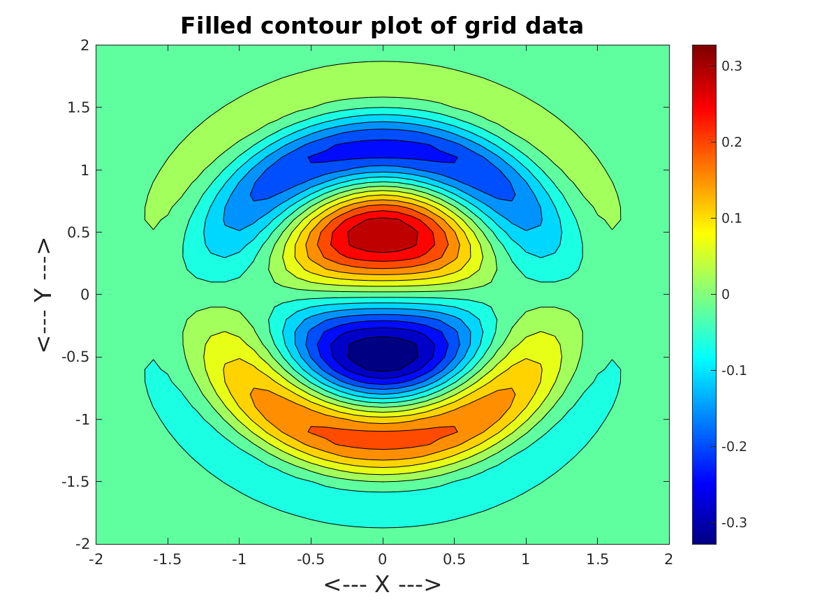
grid_fill_contour records, on a 41x41 grid over [-2,2]x[-2,+2], the values z = exp(-(x^2+y^2)) * cos(0.25*x) * sin(y) * cos(2*(x^2+y^2)). A filled color contour plot is created.
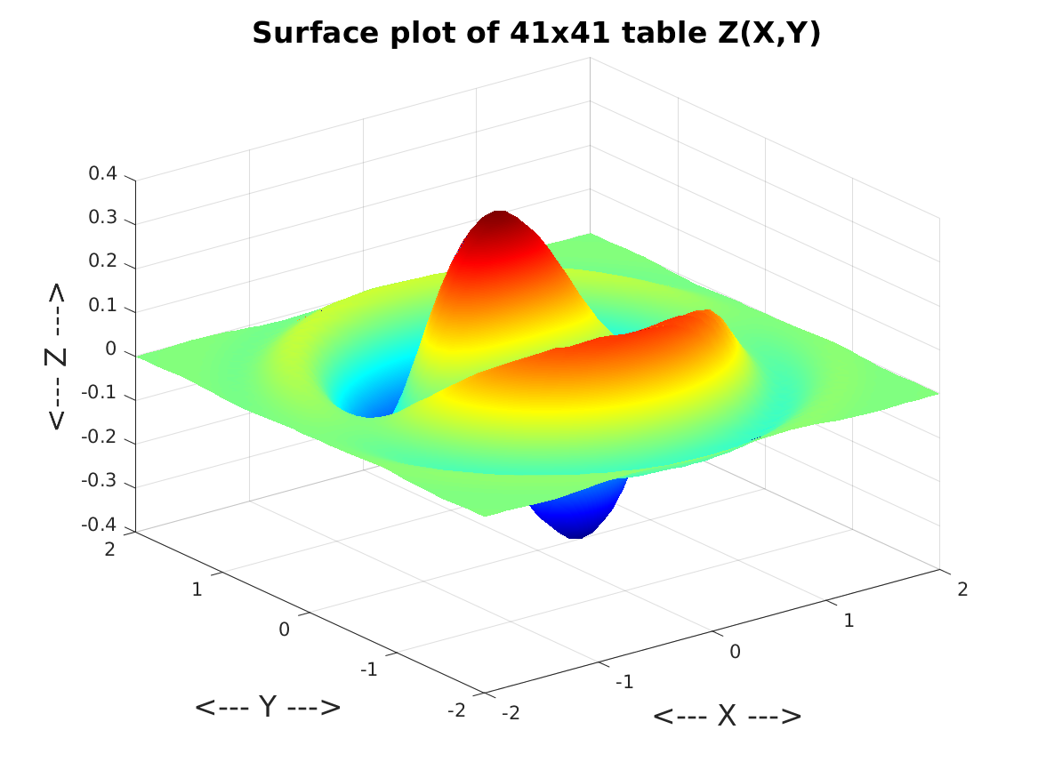
grid_surface records, on a 41x41 grid over [-2,2]x[-2,+2], the values z = exp(-(x^2+y^2)) * cos(0.25*x) * sin(y) * cos(2*(x^2+y^2)). The data is plotted as a surface.
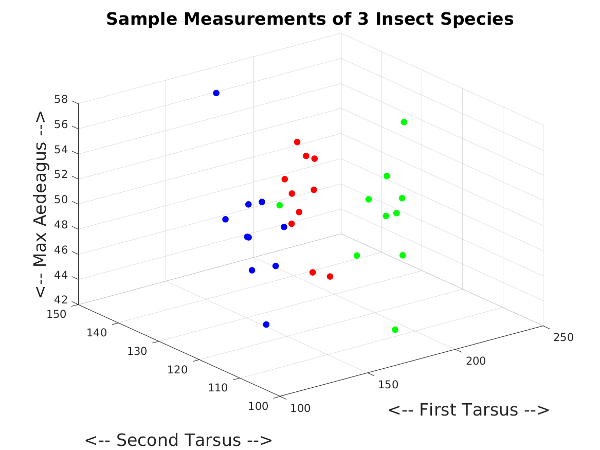
insect_scatter3d involves 3 data sets, each containing 10 measurements of 3 quantities for each of 3 species of insect. The quantities are first tarsus width, second tarsus width, and maximum width of the aedeagus. It is of interest to know whether these three measurements are enough to differentiate between members of the three species. A 3D scatter plot is created.
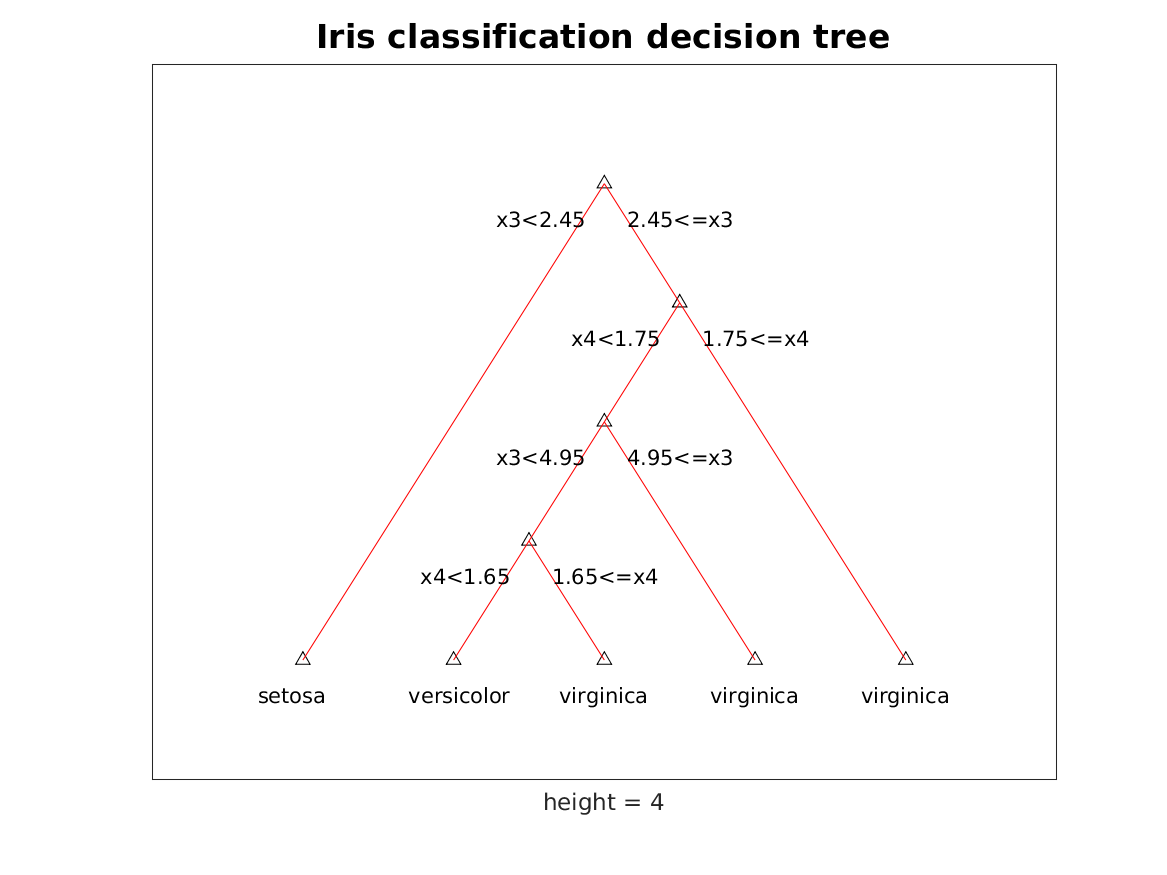
iris_decision_tree uses MATLAB's treeplot() command to display a decision tree for the iris classification process.
iris_subplots demonstrates the use of subplots. In this case, there are three varieties of iris, and for each, several specimens have been collected and measurements recorded for sepal length, sepal width, petal length and petal width. It is desired to create a 4x4 array of plots of each possible pair of variables. Moreover, data is to be color-coded by iris variety.
least_squares_plots compares 15 pairs of (x,y) data, the least squares line that approximates their behavior, and a quadratic curve that is much closer to the data.
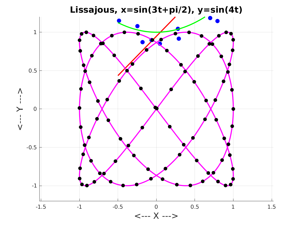
lissajous_plot records 1000 points on a Lissajous curve defined by x=sin(3*t+pi/2), y=sin(4t). The curve is to be plotted and every tenth point marked.
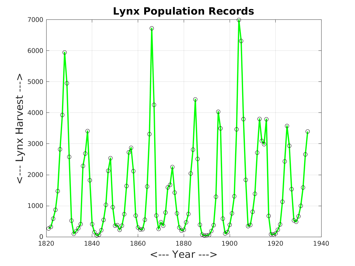
lynx_plot makes a line plot of the yearly lynx harvest from 1821 to 1934. Data points are marked by circles.
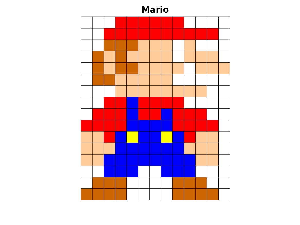
mario_fill makes a simple image of Mario, by constructing a grid of squares filled with color.
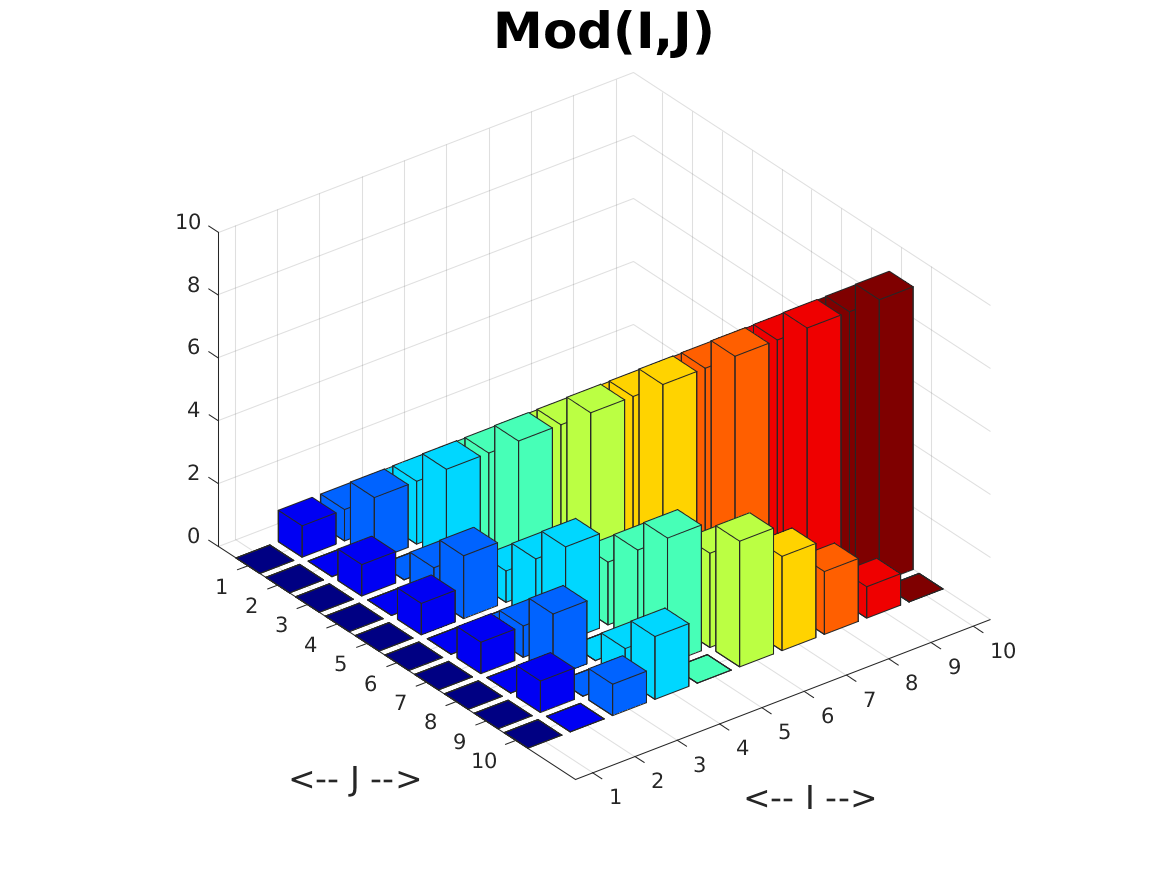
mod_bar3d makes a 3D bar plot of the values of Z(I,J) = mod ( I, J ).
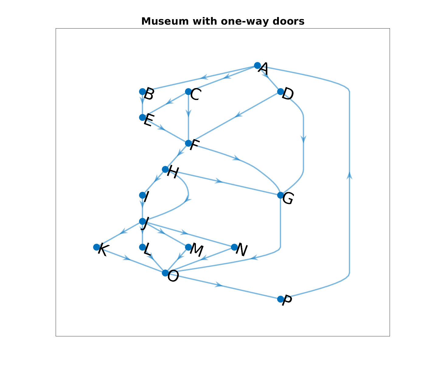
museum_digraph sketches the map of the galleries of a museum that are connected by one-way doors.
network_graph describes a graph as a set of edges, defined by pairs of nodes.
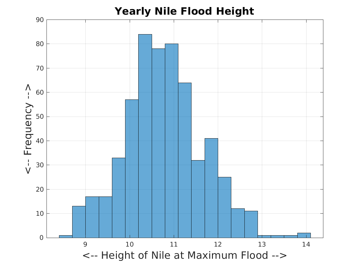
nile_histogram makes a histogram of the yearly measurement of the height of the Nile at maximum flood. By lumping the data into bins, it is easier to see the range of flood heights, and the probability of various values in the range.
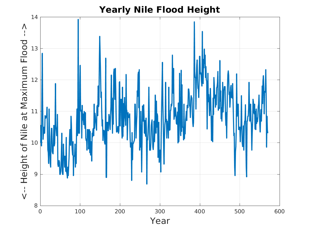
nile_plot makes a line plot of the yearly measurement of the height of the Nile at maximum flood.
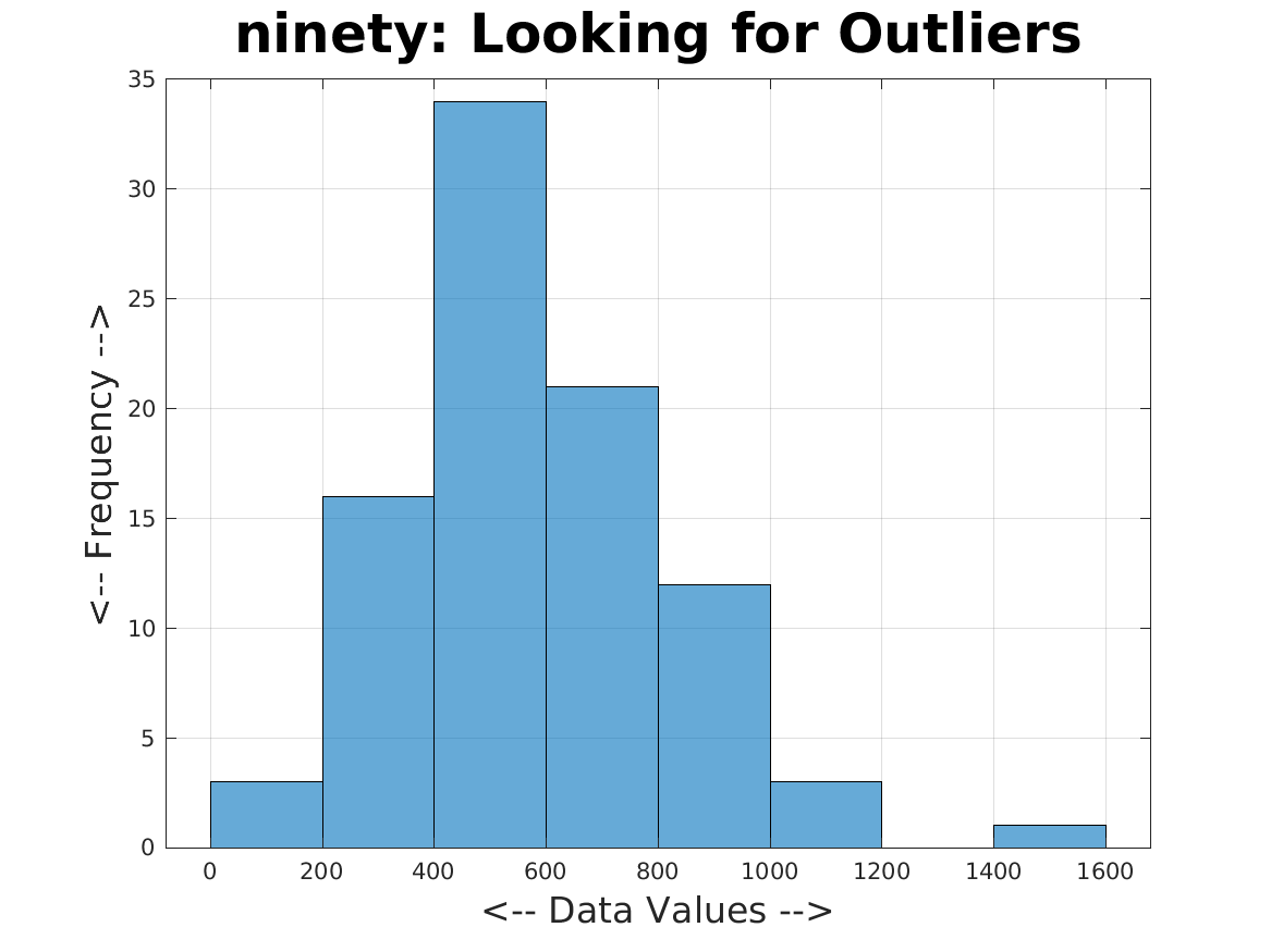
ninety_histogram considers 90 numeric values. We create a histogram, to see how the data spreads out across its range. We spot outliers as histogram bins of low occupancy that are far from the rest of the data.
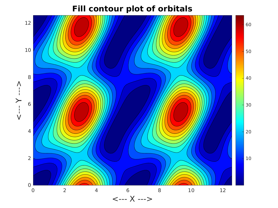
orbital_fill_contour records, on a 101x101 grid over [0,4*pi]x[0,4*pi], the minimum distance between two planets given a pair of orbital angles. The data is displayed as a filled color contour plot.
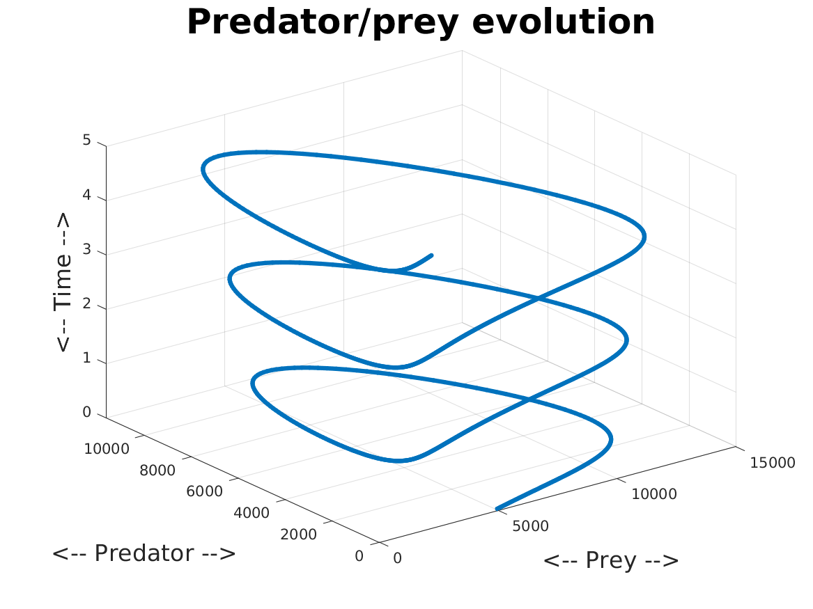
predator_plot3d models the change in population over time of foxes and rabbit. A 3D line plot of prey, predator, and time values is made.
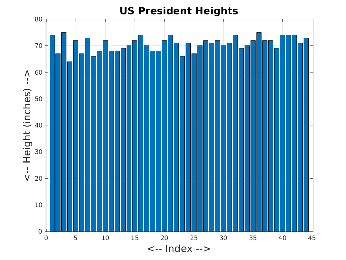
president_heights_bar plots the heights of US presidents in inches, as a bar plot.
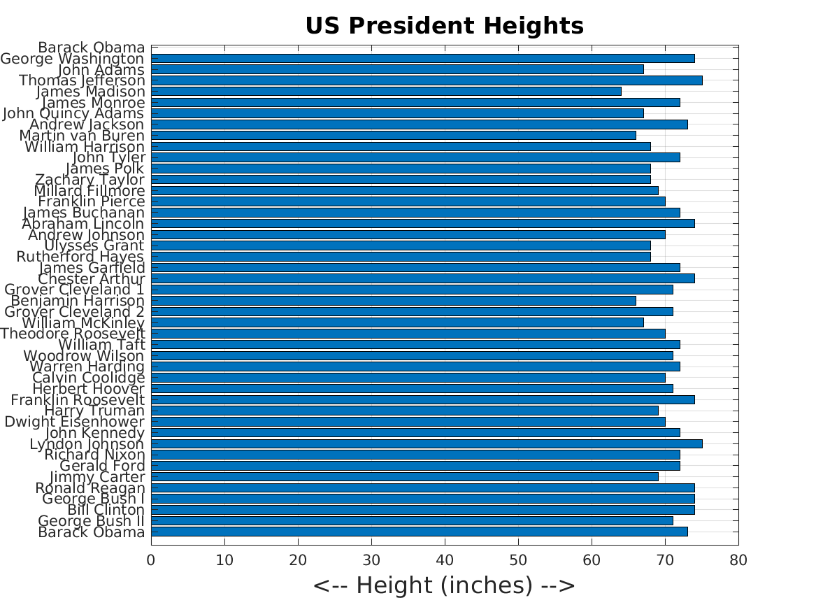
president_heights_barh plots the heights of US presidents in inches, as a horizontal bar plot, with names as the y-tick labels.
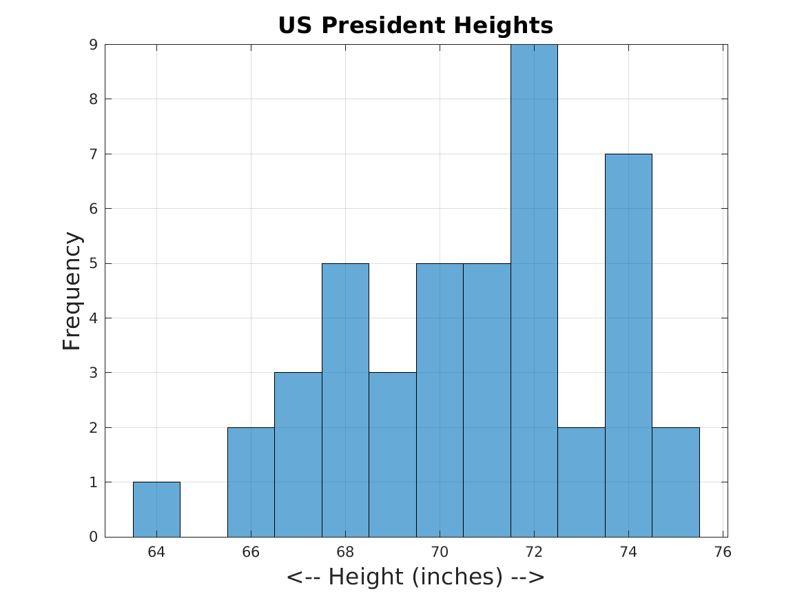
president_heights_histogram plots the heights of US presidents in inches, as a histogram. By grouping the data by height, we lose the ability to identify specific cases, but we are better able to see the range of heights, and to judge the frequency of various heights.
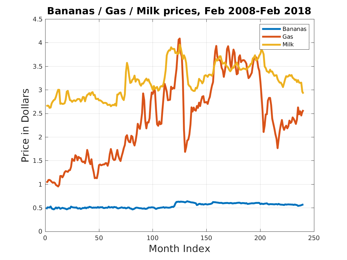
price_plots reads a table of average monthly prices for 11 consumer products, between February 2008 and February 2018, as compiled by the Bureau of Labor Statistics, and plots together the prices of three of the items.
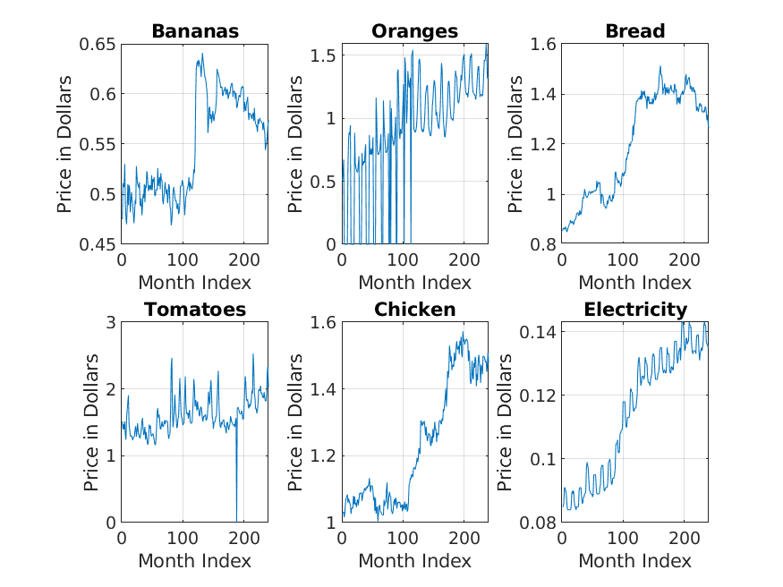
price_subplots reads a table of average monthly prices for 11 consumer products, between February 2008 and February 2018, as compiled by the Bureau of Labor Statistics, and makes six subplots, of the first 6 items in the list.
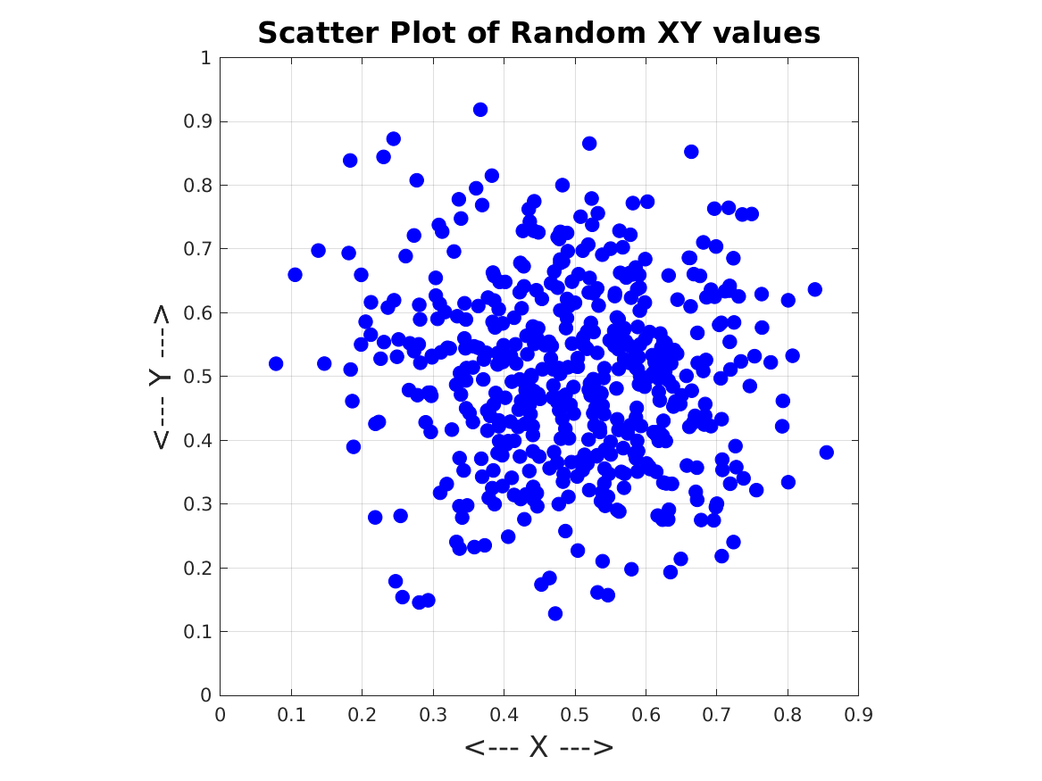
random_scatter generates 500 pairs of (X,Y) data, which lie in the unit square, and tend to cluster around (0.5,0.5).
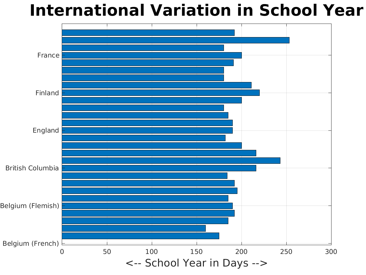
schoolyear_barh displays the variation in the length of the school year across various countries. A horizontal bar graph is used, which makes it easier to display the country name next to the bar.
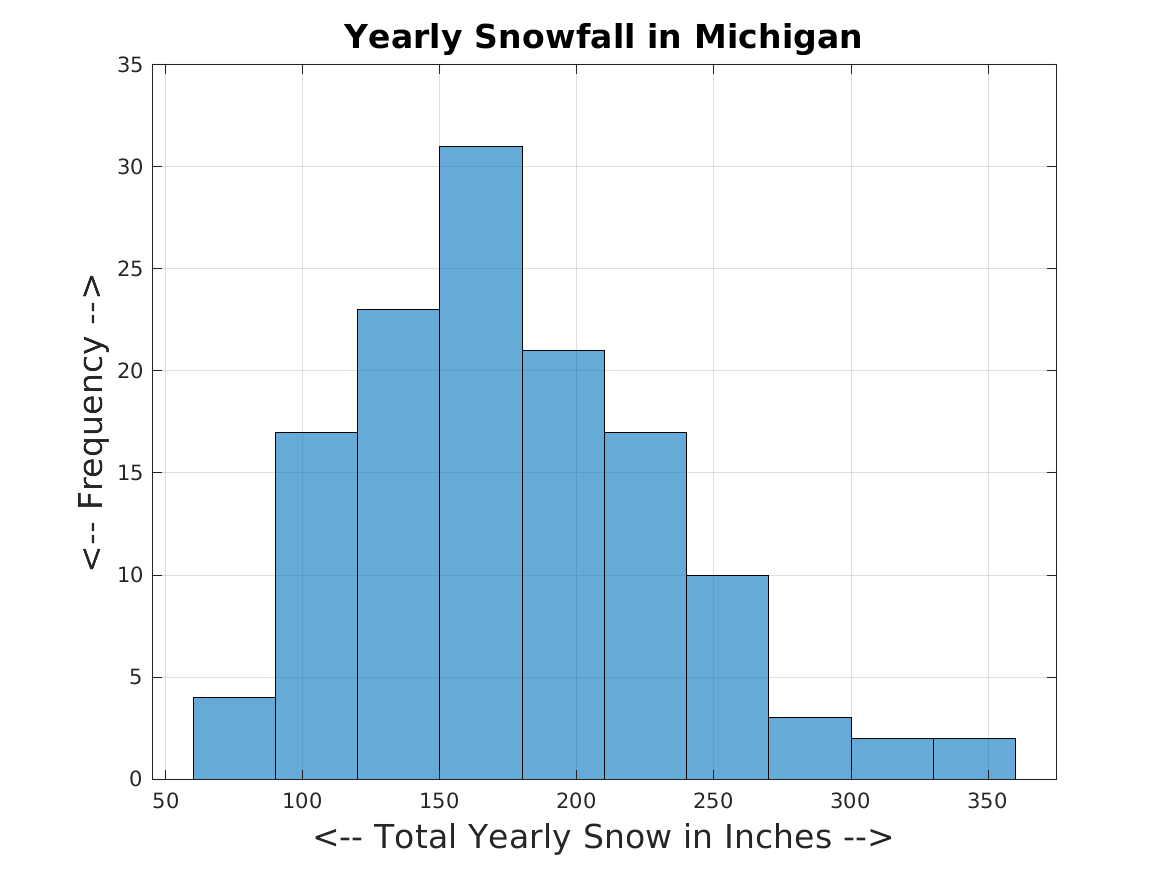
snowfall_histogram makes a histogram of the yearly snowfall totals at Michigan Tech.
snowfall_plot makes a line plot of the snowfall at Michigan Tech.
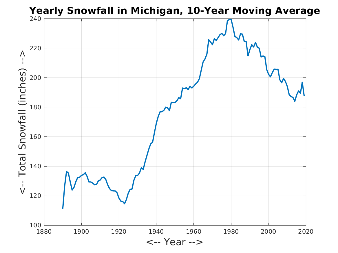
snowfall_smoothed_plot computes a 10 year moving average of the snowfall at Michigan Tech, and plots the smoothed data.
sombrero_surface plots the function z=sin(r)/r as a 3d surface.
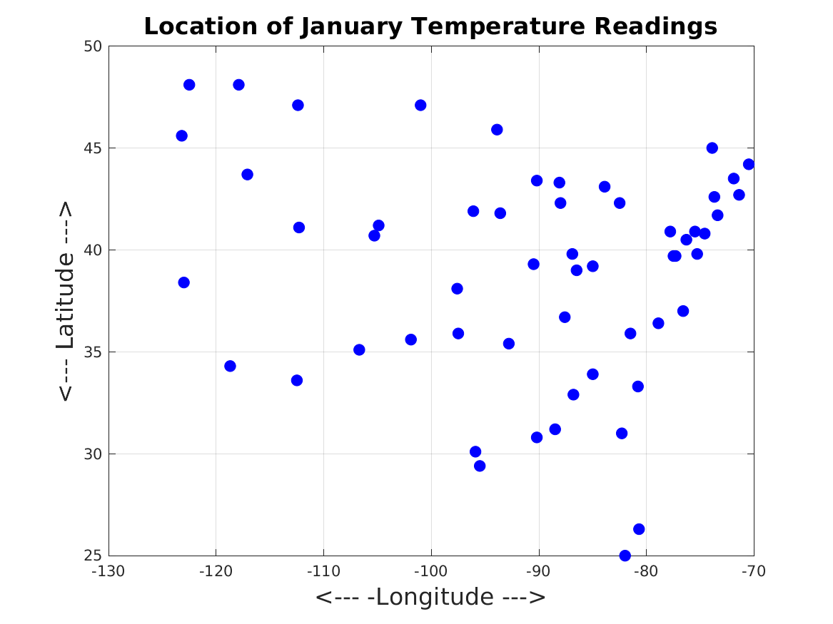
temperature_scatter shows locations in the US where the January temperature was recorded.
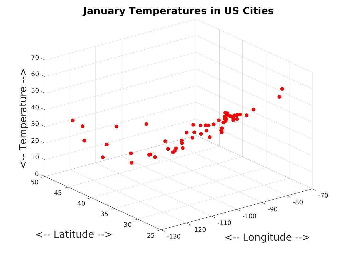
temperature_scatter3d shows temperatures and locations in the US where the January temperature was recorded.
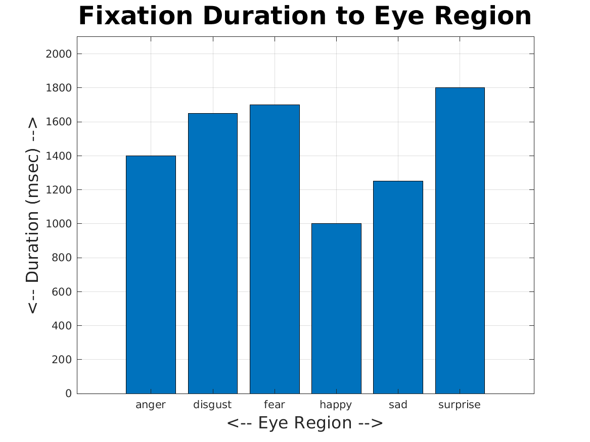
track_bar considers an eye-tracking experiment in which the eye was focused on different regions for different durations. Each region has a text label. A bar graph is desired, in which the bar for each duration is given the appropriate label.
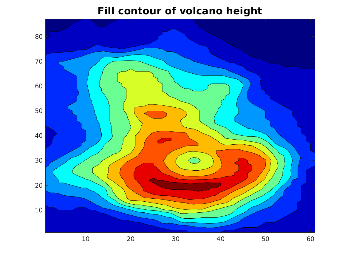
volcano_fill_contour displays a color contour plot of local elevation around a volcano.
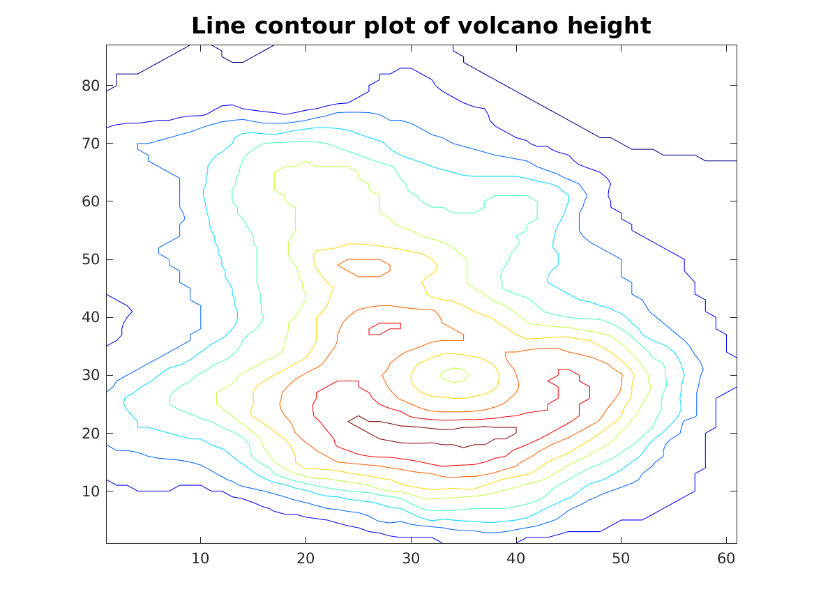
volcano_line_contour displays a line contour plot of local elevation around a volcano.
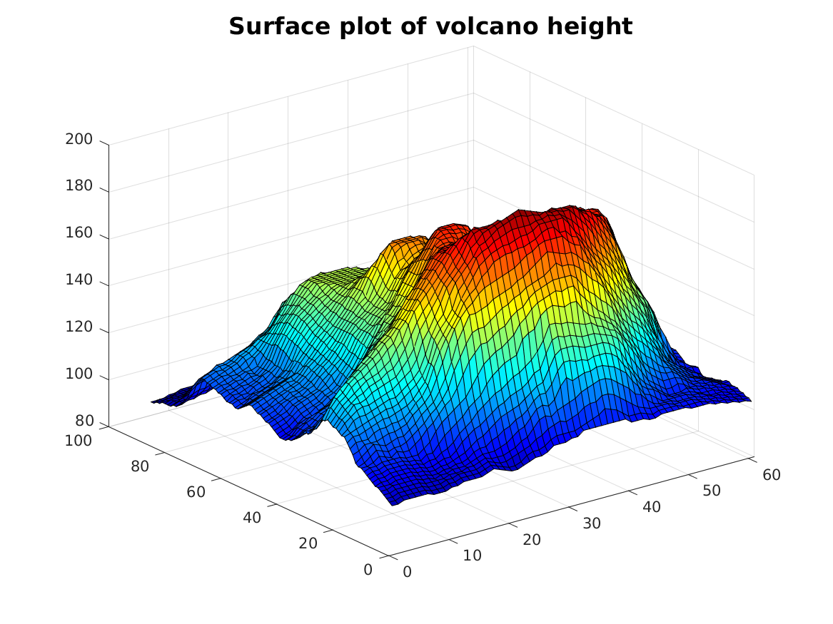
volcano_surface displays a surface plot of local elevation around a volcano.
web_digraph displays a directed graph or "digraph", in which edges have a direction and a weight.